Outsidaz
Logo Design + Branding
Outsidaz is a video production company specializing in the creation of high-quality commercials, engaging social media content, compelling short films, and impactful documentaries. Their founder, Sean, approached us for comprehensive branding services, including a distinctive new logo design and a website (which is currently in development).
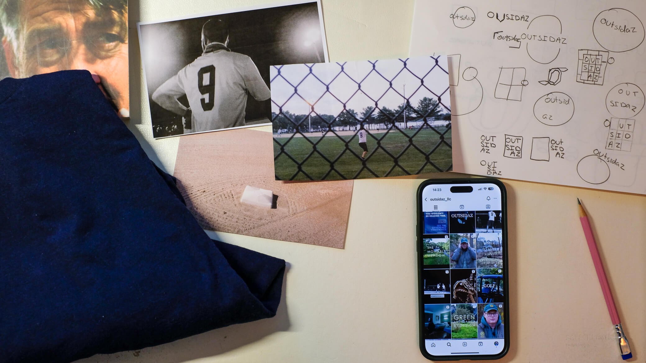
The brand mark itself subtly nods to various elements: the chain-link fences often found around the softball field, as well as the shape of a film reel. More directly, it takes the form of the number “0” as seen on the back of a softball uniform, with the addition of the tails sticking out on bottom-left and top-right, similar to a hurricane symbol—a force of nature, akin to Sean’s creative expression.
For a video production studio, it is important that the Outsidaz's logo is dynamic. So, we set in motion. Rather than a static zero, the logo fluidly opens into bracket shapes—visually representing the framing of a video shot. This dynamic element allows the logo to frame the company name and move expressively as a key component of their overall branding.
The name Outsidaz holds personal significance for Sean, originating from his softball team – a group of friends who he has documented in two short films over the past decade. The team's colors directly inspired the logo's palette, creating a meaningful connection to the company's roots.
